Product Managers And Data: Cohort Analysis
Table of Contents
I am all about numbers when it comes to driving decisions. That’s the most accurate and tested way in ensuring that you are pursuing the right thing. Not to say that we should not focus on things like customer development, but numbers certainly can shed a lot of light on whether the product is on the right track.
There are certain approaches to analyzing product data that universally apply to all projects, and can yield some interesting insights given that you put some time in it. Cohort analysis is one such approach.
The awesomeness of cohort analysis is that instead of looking at individual users in isolation, you start looking at them as if they are members of groups that have certain behaviors in common. Think of it this way - when you are looking at increased traffic or engagement with your site, you see trend lines that give you an all-up view of things. Take this chart as an example, showing you the number of unique visitors per month, augmented with a view of how many of those were actively engaged with the product:
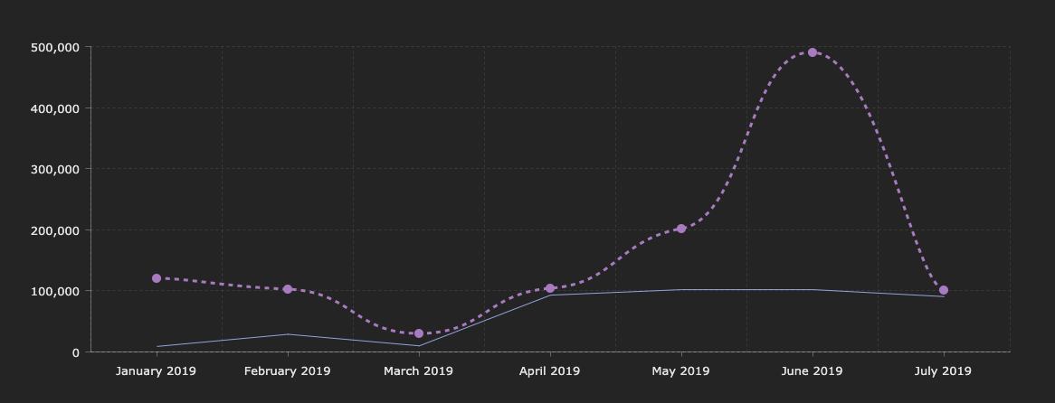
While it might be interesting to see your numbers change (doesn’t really matter in which direction), this doesn’t really help you understand your customers better. We can see that the overall number of unique users go up, but the engagement rates are a bit flat, to say the least. Why is that happening? Is it necessarily a bad thing, or you are getting a loyal fan base and the occasional spikes are just that - anomalies? Instead of looking at your customer base as a uniform blob, we need to learn how to break them down into groups with similar characteristics - cohorts.
There are many variations of a customer cohort (almost anything can be a cohort feature). In this post, I am going to focus on a single metric that I think is more or less universally understood - retention. Retention is the measure of how many customers you keep over time, compared to a given “baseline” period. For example, you might want to track the retention of customers who have purchased certain products on your site, and continue coming back to purchase more.
👋 NOTE: You can get started with the Jupyter notebook ahead of time, if you want to jump right into code and data exploration!
The setup #
Because, for obvious reasons, I am not able to share any real data from the projects I work on, I am going to use a “dummy” dataset. There is an example superstore order dataset that we can use, that contains all the relevant information that allows us to build out user cohorts.
Additionally, it’s key to make sure that all the pre-requisites are ready - I recommend you install each of these on your local development environment:
Worth mentioning that these would be needed on your machine in most cases when you deal with data analysis and Python - if you plan to dig deep into other metrics for your product, it won’t be the worst idea to keep these handy at all times.
Once pre-requisites are installed, you can start the Jupyter environment with:
jupyter notebook
This will give you the ability to experiment with data and metrics in an interactive environment that also provides convenient visualization affordances. You don’t have to use Jupyter, but it’s strongly encouraged.
Also, I highly recommend checking out a blog post written by Greg Reda that outlines some of the items we discuss below. The approach is heavily influenced by his code.
Shaping the data #
Before reading this section, keep in mind that I am operating on a dataset that I did not shape myself, which means that I have to pre-process it to be able to run analysis. In a lot of cases, when working with real product data, you will be able to do most of the pre-processing and data shaping right as you query your datastore. For example, both SQL and Kusto are extremely powerful query languages that can make your data 99% ready for cohort analysis - you will just need to plug in the CSV and do some final checks.
We can start by loading up the data from the dataset by using the standard read_csv function in pandas:
import matplotlib.pyplot as plt
import matplotlib as mpl
import pandas as pd
import numpy as np

working_dataframe = pd.read_csv('superstore-data.csv', encoding = 'ISO-8859-1')
working_dataframe.head()
The assumption I am making here is that the CSV file is located in the same folder as the notebook - you can modify the path as you see fit. Similarly, you can adjust the encoding of the file where necessary - you will almost always know the encoding is wrong when pandas will scream at you!
What the read_csv function does is create a data frame - a two-dimensional labeled data structure with columns. In other words, a data frame is a list of vectors of the same length. Data frames are almost the same concept as tables, minus some operational sugar.
Calling head is going to give us a snapshot of what’s inside the data frame, to ensure that we’re looking at the right information quickly. You can pass an optional integer argument that tells pandas how many rows you want to extract, from the top of the data frame.
The data frame we just created from the superstore CSV contains a lot of information that we do not need for the analysis, so we’ll go ahead and create a new data frame based on the one we already have, that contains just two columns - the customer ID and the order date. And we’ll also validate the output with head.
analysis_dataframe = working_dataframe[['Customer ID','Order Date']].copy()
analysis_dataframe.head()
Because in the analysis example I am focusing on vanilla retention, we really don’t care about order amounts or any other feature for that matter. I want to know how many users that made an order did it again over time.
👋 NOTE: You don’t want to do this in production scenarios, as you generally want to have more insights into how your users behave and what groups are out there.
In the current state, the column names are “human-readable” - they have friendly names, that can be problematic to refer to in code. Let’s fix that with this snippet:
analysis_dataframe.columns = analysis_dataframe.columns.str.strip().str.lower().str.replace(' ', '_').str.replace('(', '').str.replace(')', '')
analysis_dataframe.head()
Calling this function will change Order ID to order_id - much more manageable, and easier to refer to from Python code.
Next, we need to make the dates look more standard. In the current format, the order_date column contains dates in the m/d/YYYY format. We need to change that to YYYY-mm-dd. Lucky for us, we can use the built-in to_datetime function to make the transform.
analysis_dataframe.loc[:,'order_date'] = pd.to_datetime(analysis_dataframe.order_date)
analysis_dataframe.head()
Because cohorts in this example will be identified by the year and month in which a purchase was first made, we need to create a new column that has that information. We can create a new column and transform the data already in order_date - we’ll call it order_period:
analysis_dataframe.loc[:,'order_period'] = analysis_dataframe.order_date.apply(lambda x: x.strftime('%Y-%m'))
analysis_dataframe.head()
The fact that we choose year and month here is specific to the scenario at hand. You can just as easily monitor cohorts and orders over days, depending on your business needs.
With the order_period column, we are just removing the day from the date we already have, so anything like 2014-04-12 becomes 2014-04.
With this information, it’s now possible to assign cohorts to individual rows. A cohort association for a customer is defined by when we saw them place an order first. For that, we can use the following snippet:
analysis_dataframe.set_index('customer_id', inplace=True)
analysis_dataframe.loc[:, 'cohort'] = analysis_dataframe.groupby(level=0)['order_date'].min().apply(lambda x: x.strftime('%Y-%m'))
analysis_dataframe.reset_index(inplace=True)
First we set the index to the customer_id column (instead of the default dataframe indices) - this allows us to have a baseline for grouping rows. Next, we create a new column called cohort, that groups all orders by customer ID - its value will be representative of the minimum date available for that customer, that is the first time we saw them on the site. Just as we previously looked ar order periods, cohorts simply need the year and the month, since the data analysis is done on a monthly cadence.
Once we’re done processing, we reset the index to be the one that was assigned to the data frame by default. All the information we now need is available - let’s group entities by cohort:
grouped_cohort = analysis_dataframe.groupby(['cohort', 'order_period'])

cohorts = grouped_cohort.agg({'customer_id': pd.Series.nunique})

cohorts.rename(columns={'customer_id': 'total_users'}, inplace=True)
cohorts.head()
The snippet above will shape our data in a way that allows us to clearly see cohort movement - how user groups fluctuate over time:
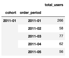
We pretty much use the two columns, cohort and order_period, as the grouping “indices” and count the number of unique that belong to each.
Cohort analysis #
Time to assign cohorts! For that, again referring to the post written by Greg Reda, we can use the arange function in numpy to identify the cohort identifier.
def cohort_period(df):
    df['cohort_period'] = np.arange(len(df)) + 1
    return df

cohorts = cohorts.groupby(level=0).apply(cohort_period)
This particular piece of code might seem a bit confusing, so let’s have a better description of how cohort identifiers are determined.
Say we have a customer, that has first placed an order in November of 2011, associated with the 2011-11 cohort. We then see them again in January of 2012, so - 2012-01. The cohort identifier in this case can be determined by the following function:

The cohort is dependent on m, the period of the order and n, the period we first saw the customer. We use the absolute value because month differences in some cases can produce negative values, so we want to normalize them. The example above can then be formalized as such:

Let’s take an example from the table above, and once again - do the value substitution for cohort 2011-01 and the 2011-03 order period. Let’s plug in the values:

Let’s see what happens if we run the code above for the data:
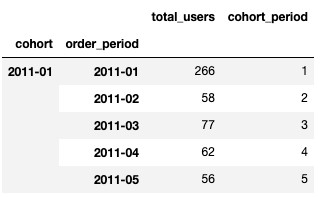
Looks right - arange takes care of the heavy lifting for us, on a per-data frame basis. Next, we need to have a better understanding of the size of each individual cohort group. To do that, we can use:
cohorts.reset_index(inplace=True)
cohorts.set_index(['cohort', 'cohort_period'], inplace=True)

cohort_group_size = cohorts['total_users'].groupby(level=0).first()
cohort_group_size.head(20)
Just like we did before with grouping by cohort and order_period, we now group by cohort and cohort_period to determine how many users fall into each bucket. It’s easier to visualize what you need to know here - think of the heatmap that we need to generate for cohorts:
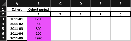
The highlighted column is the value we’re after - the 100% for a given period. For example, if we look at this table, in January of 2011, determined by the 2011-01 cohort, we had 1200 users. That is our baseline that we’ll use to determine percentage of users that we retain down the line. The snippet above will give us the values we need!
Next, we can unstack the data frame and see the cohorts visualized. The unstack function does a pivot on the data frame and instead of having a “stacked” view like we’ve seen above, where cohorts and their periods are presented in row form, we will be able to see them in row and column form.
Unstacking, however, is not enough. If we do a vanilla unstack, we’ll get user counts by cohort:
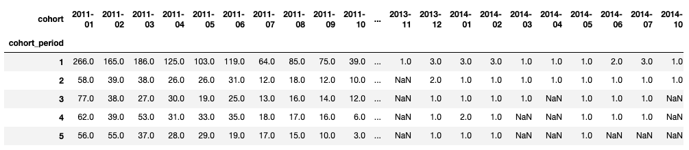
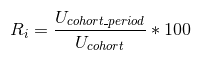
This is pretty much the presentation that we’re aiming for, but we need to see percentages - the retention rate, which is representative of the ratio of users that we first saw in the assigned cohort, added the cohort period. To do that, in addition to the unstack, we need to remember the formula for the retention rate over each cohort column:
In code, that looks like this:
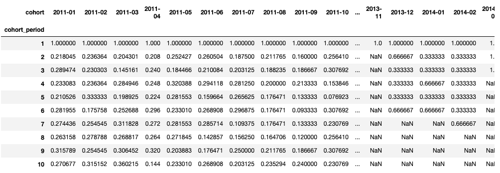
user_retention = cohorts['total_users'].unstack(0).divide(cohort_group_size, axis=1)
user_retention.head(10)
Calling divide after unstack divides each value across the column axis (identified by axis=1) by the number of total customers within the associated cohort that we calculated earlier. We’re not going to multiply by 100 for now. Running the code will give us this:
With this information handy, it’s now possible to create the visualization. We’ll use the seaborn library:
import seaborn as sns
fig, ax = plt.subplots(figsize=(12,8))

plt.title('Cohorts: User Retention')
sns.heatmap(user_retention.T, mask=user_retention.T.isnull(), annot=True, fmt='.0%', ax=ax, square=True);
plt.yticks(rotation=0)
plt.show()
The interesting call here is to heatmap. First, we pass it the data - the transposed user retention data frame. Columns became rows, and rows are now columns - notice that cohort periods in the data frame head are in rows, which makes reading the data a bit harder at a glance. The mask argument determines which cells we want to hide, and that would be anything that has a null value.
Here is what we get:
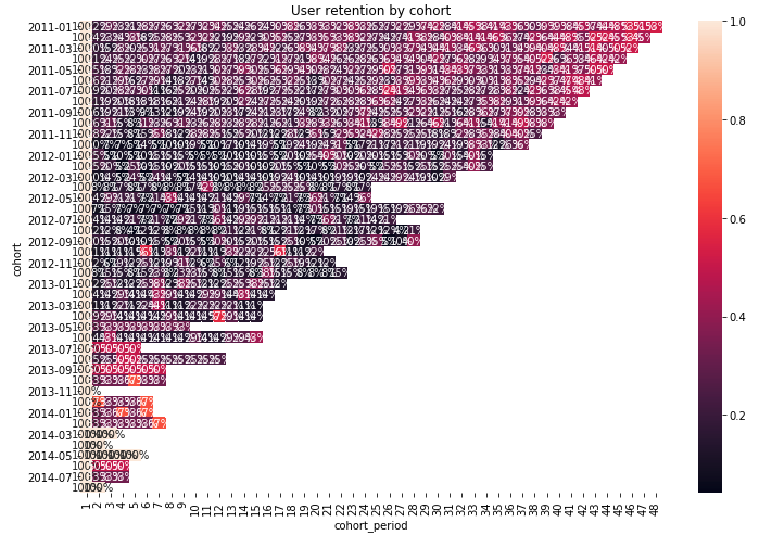
A bit packed - there is too much data that we are looking into (recall that we’re looking at a per-month retention for data over 3 years). We might need to either do year-by-year retention, or reduce the timeframe at which we’re looking. Here’s how, in an end-to-end snippet:
# Set the baseline date limits.
import datetime
start_date = datetime.datetime(2013, 8, 1, 0, 0)
end_date = datetime.datetime(2014, 1, 1, 0, 0)

# Re-create the analysis dataframe.
analysis_dataframe = working_dataframe[['Customer ID','Order Date']]
analysis_dataframe.columns = analysis_dataframe.columns.str.strip().str.lower().str.replace(' ', '_').str.replace('(', '').str.replace(')', '')
analysis_dataframe.loc[:, 'order_date'] = pd.to_datetime(analysis_dataframe.order_date)

# Apply the mask and extract the relevant values.
mask = (analysis_dataframe['order_date'] > start_date) & (analysis_dataframe['order_date'] <= end_date)
target_dataframe = analysis_dataframe.loc[mask].copy()

# Apply the order period.
target_dataframe.loc[:, 'order_period'] = target_dataframe.order_date.apply(lambda x: x.strftime('%Y-%m'))

# Identify cohorts.
target_dataframe.set_index('customer_id', inplace=True)

target_dataframe.loc[:, 'cohort'] = target_dataframe.groupby(level=0)['order_date'].min().apply(lambda x: x.strftime('%Y-%m'))
target_dataframe.reset_index(inplace=True)
target_dataframe.head()

grouped_cohort = target_dataframe.groupby(['cohort', 'order_period'])

cohorts = grouped_cohort.agg({'customer_id': pd.Series.nunique})

cohorts.rename(columns={'customer_id': 'total_users'}, inplace=True)

cohorts = cohorts.groupby(level=0).apply(cohort_period)
cohorts.head()

cohorts.reset_index(inplace=True)
cohorts.set_index(['cohort', 'cohort_period'], inplace=True)

cohort_group_size = cohorts['total_users'].groupby(level=0).first()

user_retention = cohorts['total_users'].unstack(0).divide(cohort_group_size, axis=1)
user_retention.head()
We’re effectively applying a time filter to the data frame that we loaded from the CSV, and running the same analysis that we’ve done before on the scoped data. Re-rendering the heatmap, we get:
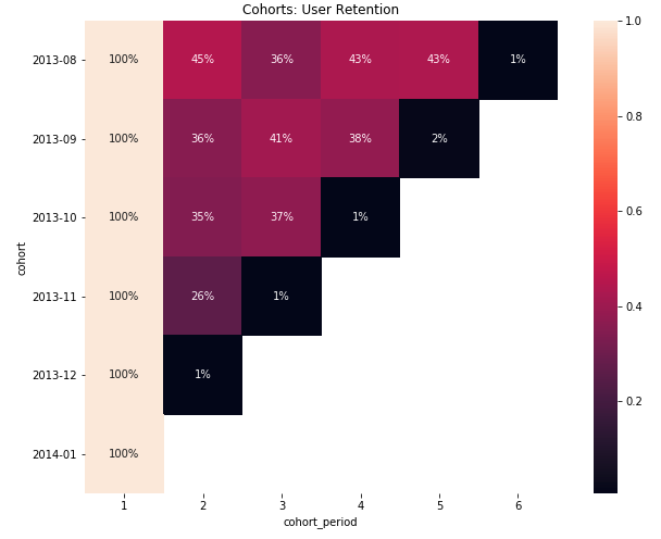
This is now something you can dive deep into and understand how cohorts are behaving and why!
Conclusion #
While cohort analysis can be formalized using the outlined approach, you will still need to make sure that you build an understanding of why certain cohort movements are happening. You can re-structure the data to contain specific features that would be of interest (for example, customers that placed an order within five minutes of the site visit).
Also keep in mind that data aggregation on visitor IDs is computationally very expensive - getting “summarized” data sets like we’ve used in this post is the easy part. The resource-consuming part is actually generating the aggregation, due to the cardinality (uniqueness) of the user identifier - after all, you want to track behaviors across unique users.