Windows Needs a Change in Priorities
Table of Contents
We need to talk about Windows priorities as a product. And I am saying this as someone who wants Windows to succeed - it’s a great OS that, despite it’s naysayers, is still one of the best when it comes to backwards compatibility and richness of functionality. I mean, I can literally run a game written for Windows 95 on Windows 11 without major issues (no, I am not going to open the SafeDisc can of worms this time). I can’t do that on macOS or Linux boxes reliably, and yet Windows is doing a-OK with this task. That being said, I am disappointed to see the direction that the OS is taking lately, and it feels like a very odd misplacement of priorities, especially given the advances that other Microsoft products are going through.
Visual Studio Code is a fantastic product. Windows Subsystem for Linux is a great way to not have to dual-boot for all those awesome Linux tools running right inside Windows. PowerToys (shout-out to Clint Rutkas for leading such a massive effort) is a great way to flight and test features before they make it into the OS (I even contributed my own tool to that collection.) The Terminal is a much-needed improvement to the console-based workflows. There is a lot of goodness that is happening in and around Windows that make my and other folks’ lives significantly easier. At the same time, and speaking as a developer and a power user, Windows seems to take one step forward and two steps back with every update, and I am not entirely sure what the root cause is. From one side of the mouth, I hear folks talk about doing everything to win developer trust, and from the other they torpedo that for short-term gains.
So what exactly am I talking about? Let’s take a look at a laundry list that I put together based on what I see from my vantage point. As I go through this, I want to call out that I have no special inside knowledge - I’ve never worked on the Windows team and don’t know how priorities are established internally. These are just my own opinions that stem from my observations of changes that have been happening in the open.
Misplaced Expectations #
UX Consistency #
There’s a meme about how there are at least ten different design conventions in Windows 11 and it’s very much “in your face” once you start using Windows 11 on the daily. It’s nowhere more evident than when you start paying attention to different controls within the OS, such as text boxes. There are inconsistencies across the OS that are just wild and stand out like a sore thumb (but now with rounded corners.) This was also a problem in the Windows 10 days, so it’s not particularly new; however, with the latest Windows version those now have another layer of inconsistencies.
I ran into this problem myself just the other week when I tried to re-design a context menu for an application I am writing. To my surprise, the context menu that was bundled with Windows Forms (the framework used for designing Windows desktop applications) was very Office XP-like and did not work with custom DPI or dark mode on Windows 11. Naturally, I thought that I could just re-use whatever context menu styles the standard OS applications use, but I guess that was too big of a leap to make because there is no such thing. Windows does have an API for creating context menus, but you’ll be mistaken if you think that will allow you to do what the OS does.
As an experiment, I thought I’d test this myself on just the notification tray icons. Let’s start with the standard network icon:
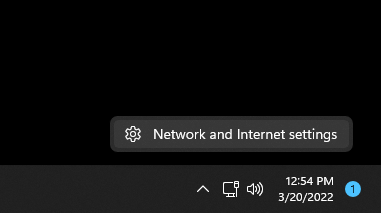
Alright - rounded corners, gray background with a monochrome icon. What about the Windows Security Center?
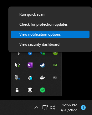
So - kind of like the previous one, but now when I hover over the selection becomes blue for some reason instead of the gray one I saw before. Moving on to the connected USB devices:
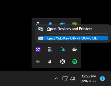
This is becoming a game of “Spot 10 differences” - the menu now has colorful icons and the padding is much smaller for selections, but still the same theme.
Let’s take a third-party app to compare - what does Spotify have?
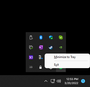
This menu is familiar to me because that’s what the Windows API allows you to create (as long as you are not creating it through Windows Forms.) There is no dark theme for this, but at least there are rounded corners. If you want to dig through undocumented APIs, you can end up with some resemblance of a dark theme, minus the corners, of course.
Lastly, I wanted to check one more third-party application - 1Password.
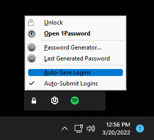
Same menu as Spotify, but without the neat rounded corners. There is just so much variability for something that needs to be an OS-level layer. And when asked what it would take to make my context menu resemble the style of Windows 11 native applications, the answer is to use an amalgamation of custom frameworks and drawing logic. What? Why do I need to know what the heck “XAML Islands” are to be able to add a context menu that is consistent with the rest of the OS?
And speaking of UI frameworks - that’s likely a part of the problem as to why there is such a spread between all these styles. That is - there is no consistent guidance for one standard UI framework. There is Windows Forms, WPF, MAUI, UWP, WTL, WinUI, MFC, and I am sure others that I am missing. Every framework comes with their conventions, constraints, and side-effects. For example, if I want to build a console application with a tray notification icon, my options are either take a dependency on Windows Forms or use the native Windows API and write everything from scratch. Want the same functionality in WPF? Same - take a dependency on Windows Forms. Using UWP? Not possible - better write a native Win32 app that accompanies it just for that. I’ve been burned a lot with this in the Windows Phone days, but now it seems that we’re going through the same stage with Windows itself.
The churn in methodologies and libraries is real, coupled with utter lack of messaging around what is the one true approach, and at this point I am just tired. Instead of focusing on adding value to my app users, I need to spend days fighting Windows APIs on the off chance that I picked the wrong .NET type of framework to build my app with. I should just write everything in C++ using the lowest level of APIs possible to make sure that I am not painting myself into a corner.
I get it - breaking from the legacy is hard for the sake of backwards compatibility, but it sure as heck would be nice to have a very clear opinion and support from the Windows development folks around doing things in a way that make your app look and feel like the rest of the OS. macOS can do this, so can Windows. I believe in you, Windows SDK and dev tooling teams.
Widgets & MSN #
Just stop trying to make MSN happen. It’s not going to happen. And I am sure that it produces revenue for folks that use the service and land there as a default home page, but I have zero interest in reading tabloid news from my taskbar or Start menu. The only people I know that use this functionality personally are those that aren’t really well-versed in customizing the default settings and removing the option fast enough.
And stop pretending that this is about the weather or widgets when all that is shown is yet another avenue to deliver junk “news” to my desktop. Windows Vista had widgets. This is not that same functionality, at least not yet.
Ads in Explorer (and everywhere else) #
The latest Windows releases became a literal billboard. From Candy Crush making it’s way into the Start menu, to OneDrive and Office pushing themselves into every crevice of the OS. I recall uninstalling all that on first Windows install only to find it coming back on the next update. And the notifications just keep on popping up everywhere. Did you know that Edge is faster? What about Bing as your default search engine? Do you enjoy Windows yet? Are you sure you don’t want Edge for this? Are you absolutely, pinky promise sure you don’t want to try the most battery efficient way to browse Twitter? Did you want to back up your stuff on OneDrive yet? Also, did you know Edge is here?
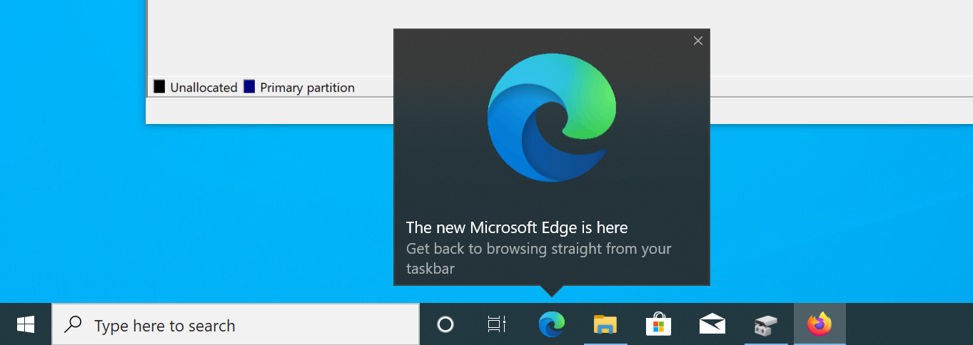
And this all comes with the OS that customers pay for. It’s not like they downloaded an ad-supported version of Windows a-la Hulu streaming plans. The cost is either baked into the price of their PC, or they paid for a key.
What’s most fascinating is that recently the Windows team even decided to experiment with ads in Explorer, which, I’d argue, should be one of the most impartial experiences within the operating system. It’s a file browser. And while the team quickly backpedaled to say that this was “an experimental banner that was not intended to be published externally,” I have no more benefit of the doubt to give here. So instead of fixing performance issues or challenges with file search, the team decided to implement a surface in Explorer that is capable of delivering advertising instead.
We already saw ads in Explorer for OneDrive, ads in WordPad, ads in the Start Menu, ads for Microsoft Teams and more. Anyone else remember when an ad literally broke an Insider build of the OS? What about ads for predatory short-term lenders in Edge?
I can spend this entire blog post listing these incidents. You can’t claim that this is an “experiment” every time you get a lot of backlash. At this point, this just seems like an effort to squeeze every bit of profit from users, consequences be damned. After all, what else are you going to do if you need to run Photoshop or Premiere for your work - switch to Linux? Good luck with that.
The risk of advertising within the OS is not just user annoyance, but also the fact that it introduces unnecessary surfaces that can cause stability or reliability issues (or, I hope not, but you never know - security problems.) What’s next - scanning my files for keywords to sell ads to the highest bidder? Ads based on file extensions, of the “Looks like you opened a folder with music - did you know that Xbox Music has the largest collection in the world” kind? Will we need to drink a Windows verification can of Talking Rain before being able to copy files?
Unnecessary Cosmetic Changes #
OK, so - we get ads everywhere and UX consistency is a pipe dream. High priority (or, seemingly high priority from my point of view) items are pushed to the side in favor of redesigning Notepad to add rounded corners and more padding, and a less visual space-efficient Task Manager. Why? No, really - why? Why spend cycles on this instead of first fixing the fundamentals? I am sure that design improvements to Notepad and Task Manager are interesting to work on, but in terms of impact on productivity - they worked well as-is, and they didn’t look too out-of-place with the OS.
I’d much rather see the same developer resources directed at fixing the Windows taskbar, which is a major step backwards compared to what Windows 10 and others had.
There’s a lot of room for improvement for the taskbar, but nothing grinds my gears more than what was done to the copy/move/delete progress indicator. In prior versions of Windows, we had this:
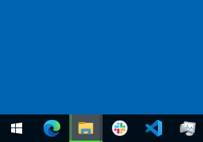
This is great - it’s a concept first introduced in the Windows 7 days, that leveraged the icon in the taskbar to display the progress. I can see from far away how the process is going and what is left, because the entirety of the icon is available to me as a progress surface.
In the latest version of Windows 11 we have this:
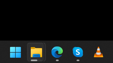
Good luck looking at that if you have a screen with a resolution larger than 800x600 - you now have a progress indicator that blends in with the indicators of open windows and is very hard to discern.
There is also no way to ungroup taskbar items. Sometimes clicking on the taskbar doesn’t really open the apps. There is no way to show window titles. Positioning the taskbar on the right side of the screen (or any other side, for that matter) is not possible. The API for the taskbar has also been kneecapped, removing the ability to display add-ons that users actually want, such as those for battery indicators.
The Start menu also now makes me go one step deeper to get the full list of apps, even if I have nothing pinned, making for this wonderful empty page experience:

I have no pinned apps and recommendations disabled, and I still have this huge amount of wasted empty space that does nothing, and I need to click on a little button in the right corner to see the rest of my apps. Why?
The context menu in File Explorer now gates some of the most useful options behind another extra click (of course, with yet another context menu style):
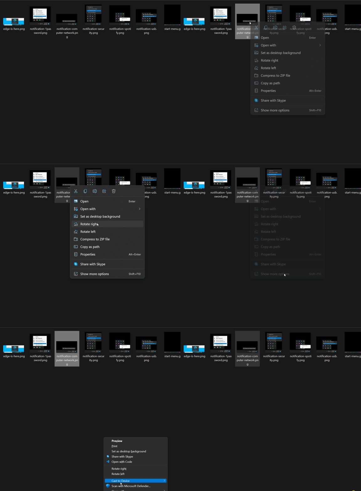
What’s the point of these changes? My first impression is that someone used a macOS machine a bit too much and decided to rip off the macOS-style Dock without really porting over anything else from the Dock behavior and trying to shoehorn it into Windows without considering any of the past conventions that make Windows what it is.
Customization Lock-In #
Did you know that to make Edge open a blank new tab you need to enroll (or fake-enroll) your machine into a device management profile? On the list of absolutely ridiculous arbitrary constraints, this takes the cake. Why can’t I customize my machine and software in way that the software already allows without having to jump through a brittle set of hoops that might break the next time I update Windows? Why can’t I control what I want different URI schemes to do? Again - with every version of Windows I see control of my machine being actively wrestled away from me, chunk by chunk.
I am sure someone will also bring an argument that “Well, you see - malware would take it over and then every Edge link would open in Malicious Joe Browser Window.” Surprise - malware can already do a lot of damage to your machine, from ransomware to exfiltrating your data by using the file APIs. The solution to that is not removing file APIs, it’s better gating the control of those for the user. Removing the ability to customize URI schemes ain’t it.
Telemetry & Microsoft Account #
I am, at this point, not even surprised - more like I am expecting this to be the reality that I will have to actively fight against. No, I do not want to log in to my machine with my Microsoft account. I don’t use OneDrive for anything. I am not on Office 365. I use my Microsoft account for mail and Xbox. I do not want it to log my search history, my files, or anything else, really. All I want is to use Windows for games and some programming - that’s it. Very simple. For that, I do not need a Microsoft account.
“But macOS…” Stop - I can use macOS without an iCloud account. Yes, I will lose access to iMessage and iCloud, but I can still opt to use the OS without it. With Windows, I have to navigate a sea of dark patterns to be able to do the same, starting with the very moment I try to install the OS.
Telemetry is falling the same bucket - just give me the ability, as a power user, to not send anything to Microsoft. Gate that behind a registry key. Or throw a massive warning that tells me that I will no longer be able to quickly diagnose app issues. I am fine with that. Visual Studio Code manages to offer a setting for not sending any telemetry - I see zero reason why Windows can’t do the same.
Conclusion #
Microsoft employs smart people, I know that. These folks know that users don’t want the things I mentioned above, but somehow all this falls on deaf ears because some revenue dashboard should have engagement and revenue charts for online (and other) services going up and to the right. I will say it again - as a developer, all the changes above seem counter to the narrative that there is an effort to win developer trust. It’s simply the opposite of that.
If the desire is truly to empower users, then there should be an effort to make the OS optimized for productivity, not an extra dollar per user for every ad click. Tricking users into signing in with their Microsoft account is not how you build trust. Arbitrary re-designs that leave developers hanging is not how you build trust. Removing the ability to customize the system the way a user wants is not how you build trust.
And you know what? With every year that passes, I am less and less trusting of putting all my eggs in the Windows basket. Sublime Text and Sublime Merge work cross-platform. Affinity Photo and its suite of products are phenomenal on macOS. DaVinci Resolve, my video editor of choice, works on Linux. With Steam Deck on the horizon, gaming on Linux is becoming better and I have even less of an incentive to stick with Windows. Trust is a funny thing - it’s hard to gain, and very easy to lose. Windows has been on a trust losing streak for a bit, and I genuinely wish that wasn’t the case. Windows has a lot of well-earned potential that, right now, is being exchanged for short-term revenue. Time will tell where that will lead, but I genuinely hope that this ship can still be turned around.
Conversation #
There is a thread on Hacker News where you can read more thoughts on this piece.